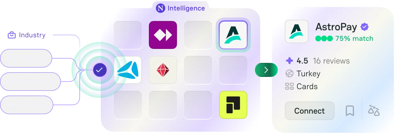
Insights
Explore interactive maps, breakdowns, and flow diagrams on payment providers and payment methods worldwide, plus taxonomy trees across the whole PayAtlas catalogue. See coverage by country, how the market splits across services, and how industries and services connect to supported payment methods.
Global Coverage Maps
Explore provider and payment method availability across global markets.
Adoption & Popularity Maps
Analyze regional payment preferences, adoption trends, and popularity.
Adoption
New
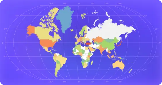
Card Payments Share by Country (Heat Map)
-
 Heatmap
-
 Cards
Cards
-
 World
World
Adoption
New
Bank Transfer Share by Country (Heat Map)
-
Heatmap
-
 Bank transfers
-
World
Adoption
New
E-Wallet Share by Country (Heat Map)
-
Heatmap
-
E-wallets
-
World
Adoption
Payment Provider Density by Country (Heat Map)
-
Heatmap
-
 Providers
-
World
Adoption
Payment Methods Popularity by Country (Heat Map)
-
Heatmap
-
Methods
-
World
Market Breakdown Treemaps
Understand how payment services and providers are distributed across the ecosystem.
Comparative Breakdowns
Compare payment methods across regions to spot dominant categories at a glance.
Flow Diagrams
Sankey diagrams that trace how industries, services, and payment method categories connect through provider coverage.

Taxonomy Trees
Radial trees that map how the PayAtlas taxonomy is organised across payment methods, services, industries, geography, and currencies.
Insights FAQ
Quick list of answers to most frequent questions.
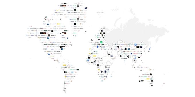
Global Payment Providers Coverage Map
What does the Global Payment Providers Coverage Map show?
It shows which payment service providers operate in each country. You can see both global players like Stripe or Adyen and local providers specific to markets like Brazil or India.
How do I read or interact with this map?
Select a country to view all available providers in that market. You can compare regions, identify overlaps, and quickly understand where coverage is strong or limited.
How can this insight help my business?
It helps you choose providers that support your target markets. You avoid integration gaps and reduce the risk of failed expansions due to missing payment infrastructure.
Who benefits most from this data?
Merchants expanding internationally, PSPs evaluating new markets, and product teams building payment stacks get the most value. It's especially useful for companies entering unfamiliar regions.
What does "provider coverage" mean in this context?
Provider coverage refers to the countries where a payment provider offers its services. This includes the ability to process payments, support local methods, and operate legally in that market.
What patterns or trends does this data reveal?
You'll notice strong provider concentration in Europe and North America, while regions like Africa or Southeast Asia often rely on fewer, more localized providers. Global providers rarely cover every market fully.
How do I use this data for market expansion?
Start by checking which providers operate in your target country. Then compare them with your current stack to see if you can expand with existing integrations or need new ones.
Can I combine this insight with other PayAtlas data?
Yes. Pair it with Payment Methods Coverage and Popularity insights to align provider availability with actual user payment behavior.
How current is this data?
The dataset is regularly updated to reflect changes in provider expansion, market exits, and new entrants. Fast-moving markets may update more frequently.
Where does this data come from?
PayAtlas aggregates provider documentation, public market data, and internal research. Each entry is validated against real-world availability and integration support.
Payment Provider Density by Country (Heat Map)
What does the Payment Provider Density by Country heat map show?
It visualizes how many payment providers operate in each country. Darker regions indicate higher density, while lighter ones show fewer providers.
How do I read this heat map?
Focus on color intensity. High-density markets like Germany or the US appear more saturated, while emerging markets show lower density.
How can this insight help my business?
It helps you evaluate competition and market maturity. You can identify crowded markets or spot underserved regions where entry barriers may be lower.
Who benefits most from this data?
PSPs looking for expansion opportunities, fintech startups entering new regions, and merchants assessing provider options benefit the most.
What does "provider density" mean here?
Provider density is the number of PSPs available in a country relative to its market size. It reflects competition and ecosystem maturity.
What patterns or trends does this data reveal?
Developed markets tend to have high density and strong competition. Emerging markets often have fewer providers but may rely heavily on local champions.
How do I use this data to assess market entry?
Target mid-density markets where competition exists but isn't saturated. These often offer a balance between demand and opportunity.
Can I combine this insight with other PayAtlas data?
Yes. Combine it with provider coverage maps to see who operates in a market, and with payment method popularity to understand demand.
How current is this data?
The heat map reflects regularly updated provider counts and market changes. Some regions evolve faster than others due to regulation and fintech growth.
Where does this data come from?
Data is compiled from provider lists, regional payment ecosystems, and PayAtlas research. It reflects active providers, not historical presence.
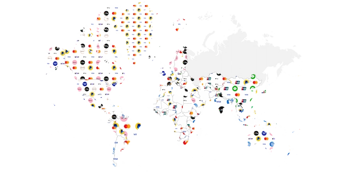
Global Payment Methods Coverage Map
What does the Global Payment Methods Coverage Map show?
It shows which payment methods are available in each country. This includes cards, bank transfers, wallets, and local methods like iDEAL or UPI.
How do I read or interact with this map?
Click on a country to see supported payment methods. Compare across regions to understand how payment infrastructure differs globally.
How can this insight help my business?
It helps you decide which payment methods to support in each market. This directly impacts conversion rates and user experience.
Who benefits most from this data?
Merchants expanding internationally, product teams optimizing checkout, and PSPs planning integrations benefit the most.
What does "payment method coverage" mean?
It refers to the availability of specific payment methods within a country. This includes whether users can realistically use that method for transactions.
What patterns or trends does this data reveal?
Cards dominate in the US and parts of Europe, while bank transfers and wallets lead in countries like the Netherlands or China. Local methods often outperform global ones.
How do I use this data to improve conversion?
Prioritize the top payment methods in each market. Offering locally preferred options reduces friction and increases successful transactions.
Can I combine this insight with other PayAtlas data?
Yes. Pair it with Payment Methods Popularity to see not just availability, but actual usage.
How current is this data?
The map is updated as payment methods expand, decline, or evolve. Rapid innovation in fintech means some markets update more frequently.
Where does this data come from?
PayAtlas combines provider integrations, payment method documentation, and regional market research to ensure accuracy.
Payment Methods Popularity by Country (Heat Map)
What does the Payment Methods Popularity by Country heat map show?
It shows which payment methods are most used in each country. You can quickly identify dominant consumer preferences.
How do I read this heat map?
Each color represents the relative popularity of a payment method in a region. Stronger intensity means higher usage.
How can this insight help my business?
It helps you align your payment stack with real user behavior. Supporting the wrong methods leads to drop-offs at checkout.
Who benefits most from this data?
Merchants optimizing checkout, product teams improving UX, and PSPs prioritizing integrations gain the most value.
What does "payment method popularity" mean here?
It reflects how frequently a payment method is used in a given country. This is based on real-world adoption, not just availability.
What patterns or trends does this data reveal?
Wallets dominate in Asia, bank transfers lead in parts of Europe, and cards still hold strong in North America. Preferences vary sharply by region.
How do I use this data to prioritize integrations?
Focus on the top 2-3 methods in each market. Supporting too many low-usage methods adds complexity without improving conversion.
Can I combine this insight with other PayAtlas data?
Yes. Combine it with coverage maps to ensure the methods you prioritize are actually supported by your providers.
How current is this data?
Popularity trends are updated regularly as consumer behavior shifts. Some markets change quickly due to mobile adoption and regulation.
Where does this data come from?
Data comes from aggregated transaction patterns, provider insights, and PayAtlas research. It reflects real usage rather than theoretical availability.
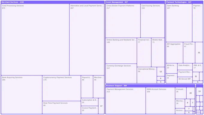
Payment Providers Breakdown by Services (Treemap)
What does the Payment Providers Breakdown by Services treemap show?
It groups payment services by category, sizing each tile by how many providers offer that service. Bigger tiles mean a service is offered by more providers.
How can this insight help my business?
It shows where the provider market is crowded and where it is thin, so you can spot competitive services and underserved niches before you build or integrate.
Who benefits most from this data?
Strategy and product teams sizing a market, providers positioning a new service, and merchants checking how many options exist for a capability they need.
How do I read the tile sizes?
Compare tiles within a category: a larger tile means more providers support that service, a small one means few do. Click a tile to open the Atlas filtered by that service.
Can I combine this insight with other PayAtlas data?
Yes. Pair it with the coverage maps to see not just how many providers offer a service, but where those providers actually operate.
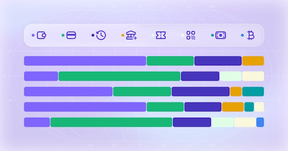
Payment Methods Popularity by Region and Country (Comparative)
What does the Payment Methods Popularity by Region and Country breakdown show?
It compares payment method categories side by side across regions, then lets you drill down to country level. You can see which categories lead where at a glance.
How is it different from the popularity heat map?
The heat map colors a world map by usage. This breakdown stacks the categories in a bar chart, so you can compare their relative weight across regions and countries directly.
How can this insight help my business?
It helps you tailor checkout by market, leading with the method categories that carry the most weight in each region instead of a single global setup.
Who benefits most from this data?
Merchants planning regional rollouts, growth teams localizing checkout, and PSPs deciding which method categories to prioritize per region.
Can I combine this insight with other PayAtlas data?
Yes. Use it with the coverage maps to confirm the leading categories are actually available from your providers in those markets.
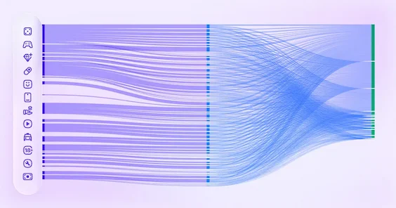
Payment Methods by Industry (Flow Diagram)
What does the Payment Methods by Industry flow diagram show?
It traces one flow from industry sectors, to the industries within them, to the payment method categories that providers support, all built from provider coverage.
How can this insight help my business?
If you serve a specific industry, it shows which payment method categories providers most commonly support there, so you can prioritize the right methods for that vertical.
Who benefits most from this data?
Providers shaping their method mix for a target industry, and merchants in a sector checking which payment categories are well supported around them.
Why do providers determine the connections?
The link between industries and methods comes entirely from provider coverage. Each provider that serves an industry and supports a method adds one connection, so wider bands mean more support.
Can I combine this insight with other PayAtlas data?
Yes. Pair it with the coverage maps and popularity data to check that well-supported categories are also available and actually used in your target markets.
Payment Methods by Service (Flow Diagram)
What does the Payment Methods by Service flow diagram show?
It traces one flow from service categories, to the services within them, to the payment method categories that providers support, all built from provider coverage.
How can this insight help my business?
If you offer or depend on a specific service, it shows which payment method categories usually come with it, so you can plan a complete payment stack around that service.
Who benefits most from this data?
Providers bundling services with payment methods, and teams checking which methods to expect when they adopt a given service.
Why do providers determine the connections?
Every connection is one provider that offers a service and supports a method, so a wider band means more providers and methods tie a service to a payment category.
Can I combine this insight with other PayAtlas data?
Yes. Combine it with the services treemap to see how many providers offer each service, and with the coverage maps to see where they operate.
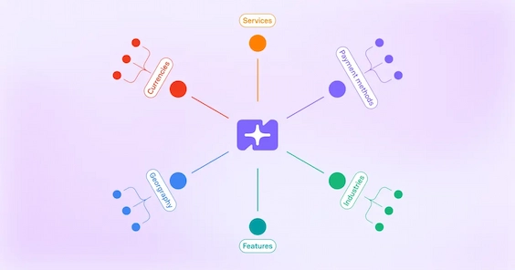
Platform Taxonomy Tree
What does the Platform Taxonomy Tree show?
It maps how the PayAtlas taxonomy is organised as a radial tree. A single root branches into five domains — payment methods, services, industries, geography, and currencies — and each domain branches into its categories and then into the individual terms within them.
How do I read or interact with it?
It opens with the domains and categories visible and the individual terms collapsed. Click any branch to expand or collapse it, hover a node to see its name and how many terms sit beneath it, and use the toggle above the chart to switch between the tidy and cluster layouts.
How can this insight help my business?
It gives you the full shape of the PayAtlas catalogue in one view — how many payment methods sit under each category, how industries roll up into verticals, how countries group into regions, and how currencies break down by type — so you can orient yourself before diving into a specific area.
Why are some taxonomies not shown?
The tree focuses on the five domains that have a clear category-to-term hierarchy. Large flat reference lists such as merchant category codes, regulators, and jurisdictions have no natural parent grouping and would make the chart unreadable.
Can I combine this insight with other PayAtlas data?
Yes. Use it as a map of what the platform tracks, then jump into the coverage maps, popularity heat maps, or breakdowns to explore any branch — payment methods, services, industries, or regions — in depth.